Graphic Designers Appreciate EPA (Style) Rules
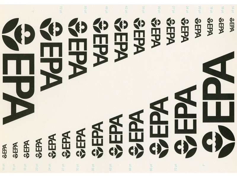
Graphic design duo Hamish Smyth and Jesse Reed have reissued the 1977 EPA graphic standards manual and shone a spotlight on design’s power to strengthen and streamline government agencies.

This page was published 8 years ago. Find the latest on Earthjustice’s work.
Hamish Smyth and Jesse Reed are fired up about a little-known set of EPA rules, ones that talk about palettes not pollutants. When the two graphic design entrepreneurs unearthed the original 1977 EPA Standards System—a manual outlining the agency’s visual identity—they knew they wanted to boost it into the public spotlight.
As Scott Pruitt continues to threaten the EPA’s core mission of protecting the environment and public health, the designers partnered with Earthjustice and the American Institute of Graphic Arts to launch an online Kickstarter campaign reissuing the EPA graphic standards manual. The project aims to preserve an essential piece of graphic design history and demonstrate how great design can strengthen and streamline government agencies. A portion of the proceeds go to Earthjustice.
I sat down with Reed and Smyth to find out how this design brainchild came to be:
Caeleigh MacNeil: What led you to create this project?
Jesse Reed: The original EPA standards manual really stood out to us. For graphic designers, it’s something that we had never seen before; we were just familiar with the EPA logo, not the longer and expanded version of the whole design system. So just from a design perspective we thought it was really important to preserve.
We also liked that it was designed for the public, and designed for good, rather than for selling a commercial product. It has an impact on people, the country, and even the world.
CM: Why did you decide to donate some of the proceeds to Earthjustice?
Hamish Smyth: We did a lot of research. When we found you guys, your mission really resonated with us. We have lawyers that we work with a lot on our books, and we love the work that lawyers can do. We thought your mission was just a great way to have an impact on the environment, using the skills of lawyers for good. And you guys have a great score for charity efficiency, meaning that money is well spent at your organization. It was all of those factors that prompted us to choose you.
Graphic design can help influence how we solve problems, including ones that federal programs are in charge of figuring out.
CM: Does this project mean something special now that the EPA faces challenges to its mission under Pruitt?
JR: Well, yeah. It was a very timely situation, us seeing this manual, and where we are politically with the EPA. Basically, what we really want to get across is design’s role in informing the public on issues. Graphic design can help influence how we solve problems, including ones that federal programs are in charge of figuring out. That’s why we wanted to do this project, to show how design can really affect the dissemination of information for these types of issues.
CM: What role do you think design has played in advancing federal programs like the EPA?
HS: Back then, everything was printed and produced on paper, and designs would actually have real-world consequences. Having a manual that standardizes an organization’s design elements—like paper type and size, for example—can result in huge efficiency savings over a big organization like the EPA. Before this manual was made, [the EPA] was designing each thing from scratch, so there was a lot of inefficiency.
JR: Yeah, and consistency within a visual language, whether we’re talking about a federal agency or any other organization, really does build trust over time. If the voice of an organization is consistent and authoritative, that really does have powerful effects on the actions that people will take.
Consistency within a visual language, whether we’re talking about a federal agency or any other organization, really does build trust over time.
The EPA is a really good example of an agency that before had many different visual languages and voices they were speaking in, and now they have one consistent language. The hope would be in turn that their voice has a much more powerful influence on a much wider audience.
CM: When you’re not designing, what do you do for fun?
HS: We’re actually opening up a bookstore in Brooklyn; selling our books, but also other graphic design styles. The last three months we’ve been living and breathing that. We’re also really big photographers—so pretty much all the cliché stuff for designers.
JR: We’re just obsessed with design, if you can’t really tell.